UX/UI Design

Product managers, startup founders, and development teams who need user-centered design that drives adoption, increases conversion, and reduces development waste

What You Get

What's Included in Our UX/UI Design

Key deliverable

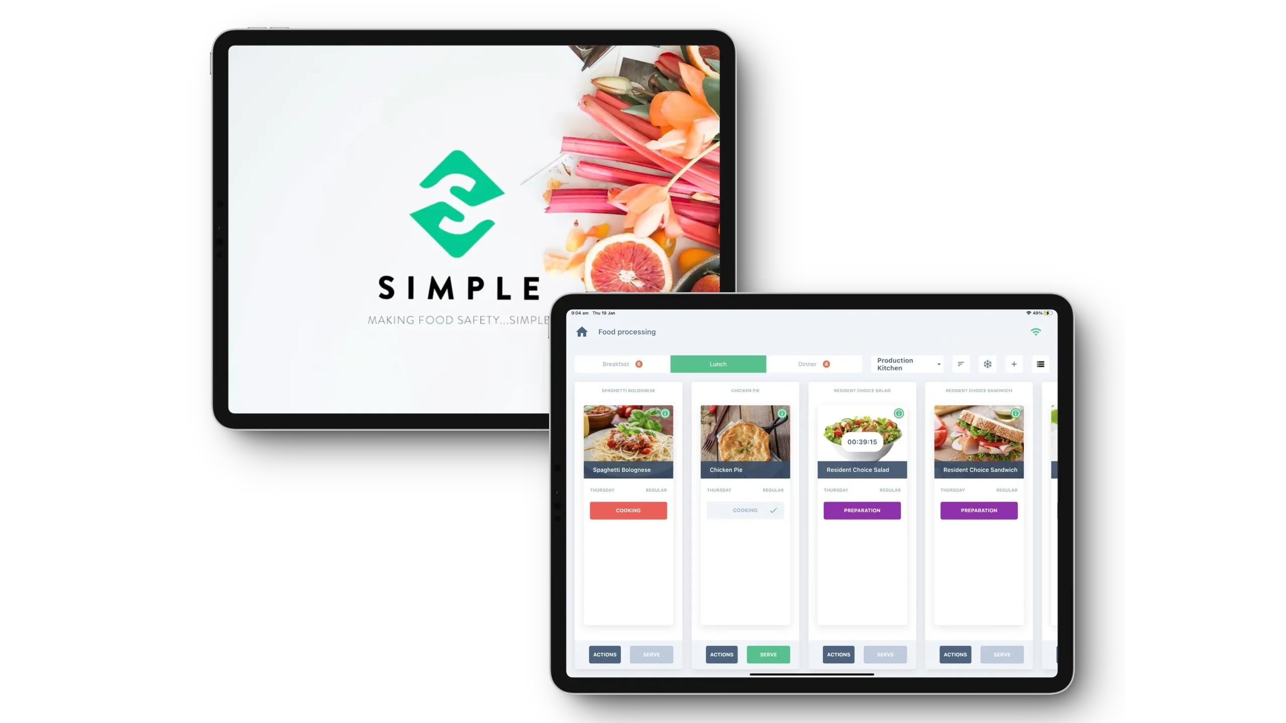
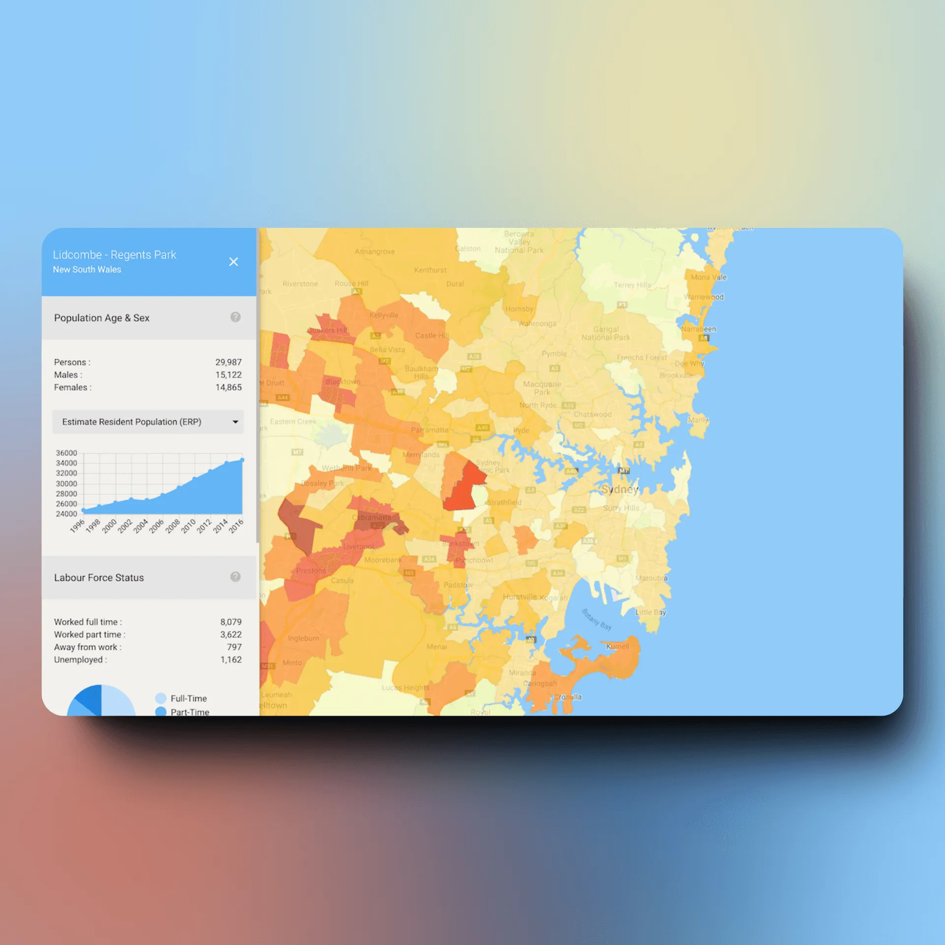
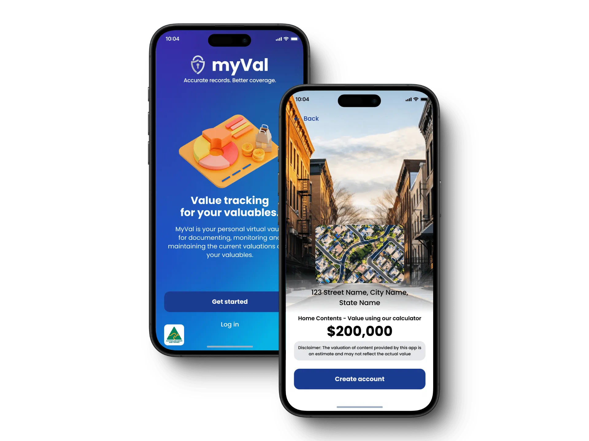
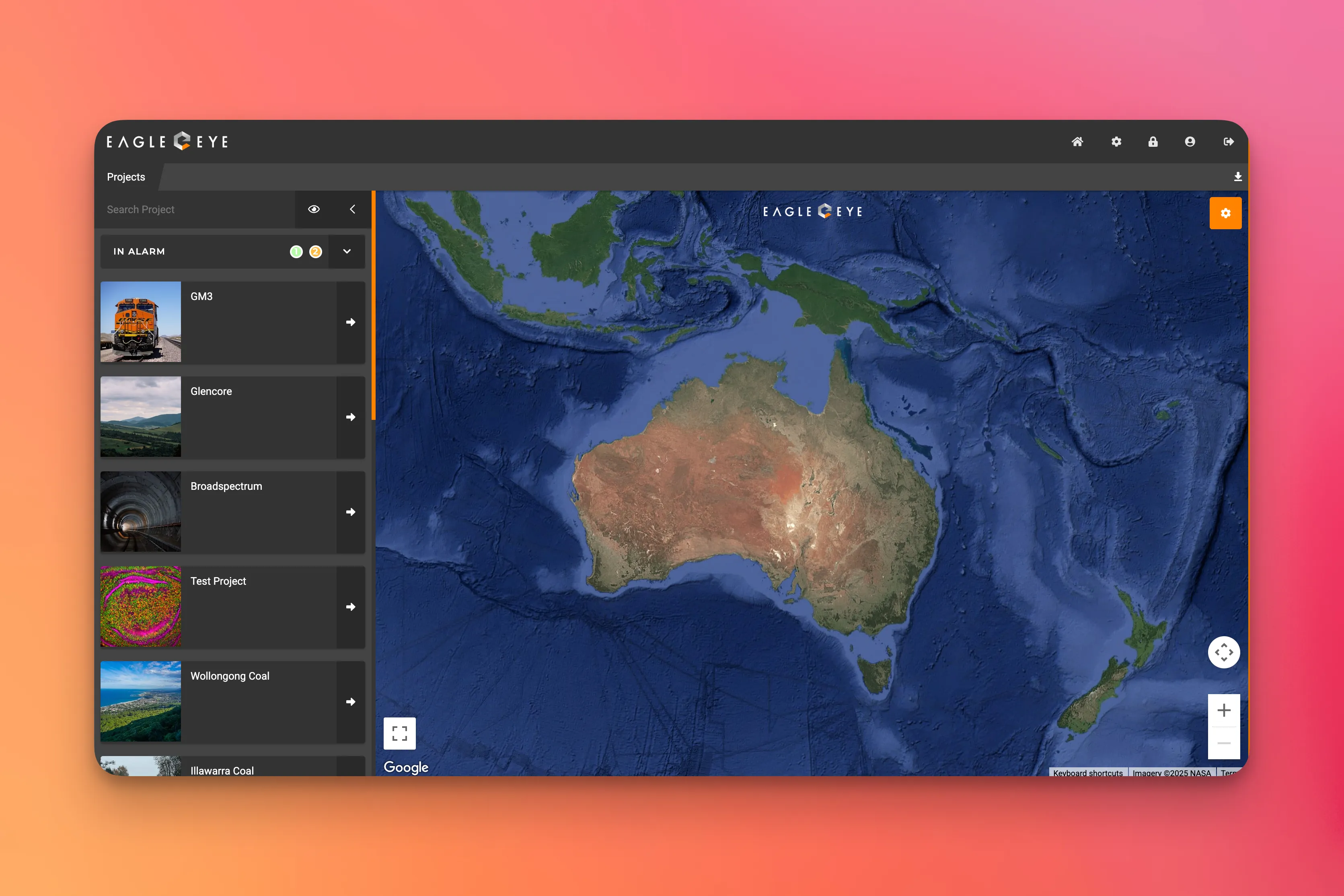
User Research & Discovery

Comprehensive user research combining interviews, analytics analysis, and competitive evaluation to understand user needs, pain points, and workflows before designing interfaces that align with actual behavior and mental models.

  • User interviews with 8-12 target users exploring workflows, frustrations, goals, and decision-making processes informing design priorities
  • Analytics review examining existing product data identifying drop-off points, feature usage patterns, and conversion funnel opportunities
  • Competitive analysis documenting UI patterns, interaction conventions, and design trends across 3-5 competitors in your market
  • User persona development creating research-backed profiles representing distinct user segments with different needs and behaviors
Key deliverable

Information Architecture & User Flows

Strategic organization of content and functionality ensuring users find what they need quickly through intuitive navigation, clear information hierarchy, and efficient task completion paths validated with users.

  • Site map development documenting complete page hierarchy, navigation structure, and content organization across product
  • User flow diagrams mapping key task completion paths from entry points through goal achievement with decision points
  • Card sorting exercises with users validating content organization and navigation labels match mental models
  • Navigation architecture design creating intuitive menu structures, breadcrumbs, search functionality, and contextual wayfinding
Key deliverable

Wireframing & Prototyping

Low to high-fidelity prototypes progressing from simple wireframes to interactive clickable prototypes, enabling early validation of navigation, layout, and functionality before visual design investment.

  • Low-fidelity wireframes focusing on layout, content hierarchy, and functionality without visual design distractions
  • Interactive prototypes with clickable navigation simulating user flows for usability testing and stakeholder validation
  • High-fidelity prototypes with realistic interactions, transitions, and micro-animations demonstrating final product experience
  • Responsive prototypes showing mobile, tablet, and desktop layouts ensuring design works across viewport sizes
Key deliverable

Visual UI Design

Polished, pixel-perfect visual design balancing aesthetics with usability, creating brand-aligned interfaces with clear visual hierarchy, accessible color contrast, and professional typography systems.

  • Visual design system with color palettes (primary, secondary, semantic colors), typography scales, spacing systems, and elevation
  • High-fidelity mockups for all key screens and states (default, hover, active, disabled, loading, error, success)
  • Responsive designs optimized for desktop (1920px, 1440px, 1280px), tablet (768px), and mobile (375px, 414px) viewports
  • Component library documenting reusable UI patterns (buttons, forms, cards, modals, navigation) with all variants
Key deliverable

Usability Testing & Validation

Structured testing with 5-8 users per iteration observing task completion, identifying friction points, measuring success rates, and validating designs solve real user problems before development begins.

  • Task-based testing scenarios reflecting real user goals with success rate measurement (can users complete workflows?)
  • Think-aloud protocols where users verbalize confusion, expectations, and decision-making revealing mental model mismatches
  • Usability metrics tracking task success rates, average completion times, error frequencies, and satisfaction scores
  • Iterative testing across fidelity levels: wireframes for structure validation, high-fidelity for detailed interaction testing
Key deliverable

Design System & Developer Handoff

Comprehensive design documentation including component libraries, design tokens, interaction specifications, and developer-ready assets ensuring accurate implementation and design-development consistency.

  • Component library in Figma with all UI elements organized and documented for team reuse and consistency
  • Design tokens (colors, typography, spacing, elevation) exported as CSS variables or JSON for code integration
  • Developer handoff documentation with pixel-perfect specifications, interaction notes, and implementation guidelines
  • Asset export providing optimized SVG icons, PNG images, and other visual assets in required formats and resolutions
Our Process

From Discovery to Delivery

A proven approach to strategic planning

Understand users, business goals, technical constraints, and design requirements through research, analytics review, and competitive analysis
01

Discovery & Research • 1-2 weeks

Understand users, business goals, technical constraints, and design requirements through research, analytics review, and competitive analysis

Deliverable: Research report with user insights, competitive analysis, technical requirements, and project roadmap with milestones

View Details
Define content organization, navigation structure, and user task flows ensuring intuitive information hierarchy and efficient workflows
02
Create low to high-fidelity wireframes and interactive prototypes enabling early validation of structure, layout, and functionality
03
Create high-fidelity visual design with brand-aligned aesthetics, clear visual hierarchy, and pixel-perfect specifications
04
Test designs with real users through task-based scenarios, identify friction points, and iterate based on findings
05
Deliver comprehensive design specifications, assets, and documentation enabling accurate implementation and design-development consistency
06

Why Trust StepInsight for UX/UI Design

Experience

  • 10+ years designing intuitive user experiences across web, mobile, and desktop platforms delivering research-informed design solutions across 18 industries
  • 200+ successful product designs including SaaS platforms, mobile apps, enterprise software, and consumer products achieving 4.5+ star average ratings
  • Expertise combining user research, interaction design, visual design, and usability testing ensuring designs balance aesthetics with usability and business outcomes
  • Partnered with companies from pre-seed concept through Series B scale, designing MVPs that achieve product-market fit and evolving interfaces as products grow
  • Global delivery experience across US, Australia, Europe with offices in Sydney, Austin, and Brussels

Expertise

  • User-centered design methodology combining qualitative research (interviews, observation) with usability testing ensuring interfaces match user mental models and workflows
  • Multi-platform design expertise spanning responsive web, native iOS (Human Interface Guidelines), native Android (Material Design), and desktop applications with platform-appropriate patterns
  • Design systems and component libraries creating scalable design foundations accelerating feature development 40-60% while maintaining visual consistency
  • Accessibility compliance and inclusive design ensuring WCAG 2.1 AA standards with Section 508 and European Accessibility Act requirements for government/enterprise procurement

Authority

  • Featured in design publications for user-centered design best practices and research-informed design methodologies
  • Guest speakers at UX and product design conferences across 3 continents
  • Strategic advisors to accelerators and venture capital firms on portfolio company product design and user experience strategy
  • Clutch-verified with 4.9/5 rating across 50+ client reviews
  • Active contributors to design communities with published case studies, design systems, and open-source UI component libraries

Ready to start your project?

Let's talk custom software and build something remarkable together.

Custom UX/UI Design vs. Off-the-Shelf Solutions

See how our approach transforms outcomes

Details:

Research-informed, usability-tested interfaces increase conversion rates 20-40% through optimized user flows, clear visual hierarchy, and friction reduction. Feature adoption improves 2-3x (40-60% typical) as intuitive design guides users and communicates value. Onboarding completion rates of 60-80% through progressive disclosure and contextual guidance.

Details:

Engineer-designed or assumption-based interfaces achieve 10-15% lower conversion rates due to unclear calls-to-action, confusing navigation, and workflows that don't match user mental models. Feature adoption suffers (15-25% typical) when interfaces don't guide users or communicate value effectively. Onboarding abandonment rates of 50-70% as users get confused and give up.

Details:

Pixel-perfect specifications and usability-tested designs reduce development rework by 30-50% through clear implementation guidance. Developers build confidently knowing designs work (validated with users). Accessibility baked in from start prevents expensive retrofitting. Developer handoff time reduced from days to hours through comprehensive documentation.

Details:

Poor design specifications lead to 30-50% of development time spent on rework: developers guessing at spacing/colors, implementing wrong interaction patterns, building features users can't find. Design-dev iterations cause delays ("that's not how I imagined it") requiring re-implementation. Accessibility issues discovered late requiring expensive retrofitting.

Details:

Intuitive interfaces reduce support tickets 25-35% as design guides users proactively. App store ratings improve to 4.5+ stars with usability praise. NPS scores reach 40-60 as users genuinely enjoy product experience. Workflows complete as designed without user frustration or manual workarounds. Word-of-mouth improves driving organic growth.

Details:

Confusing interfaces generate 40-60% more support tickets as users ask "how do I..." questions that intuitive design would answer. App store ratings suffer (3.0-3.5 stars typical) with reviews citing usability issues. NPS scores stagnate at 10-30 as users tolerate but don't love product. Users abandon workflows and create manual workarounds.

Details:

Distinctive, polished interfaces differentiate products beyond feature comparisons. Users remember and recommend products that are genuinely enjoyable to use. In competitive markets, superior UX is competitive advantage: "does same things but so much easier" drives adoption and retention even with feature parity. Design becomes selling point.

Details:

Generic or dated interfaces make products feel like commodities competing purely on features and price. Users don't remember or recommend products with forgettable design. In competitive markets, poor UX is disqualifying: "works like competitors but harder to use" drives users to alternatives with better experience.

Details:

Upfront design investment (4-8 weeks) accelerates development by 20-40% through validated designs developers implement once versus multiple iterations. Usability testing catches issues during design (hours to fix) versus post-launch (weeks to fix). Products launch with intuitive interfaces achieving business outcomes 3-6 months faster through reduced iteration cycles.

Details:

Building interfaces without design process leads to 2-3 implementation iterations as teams realize initial approach doesn't work. Discovery that users can't navigate or complete workflows post-launch requires major redesign (3-6 months) delaying business outcomes. Trial-and-error approach to finding usable interface wastes 6-12 months.

Details:

Accessibility compliance (WCAG 2.1 AA) built into design from start meeting Section 508 and European Accessibility Act requirements. Color contrast, keyboard navigation, and screen reader support validated during design. Government/enterprise procurement approved. Expanded addressable market (15-20%) reaching users with disabilities. Legal risk minimized.

Details:

Retrofitting accessibility after design and development costs 3-5x more than designing accessibly from start. Color contrast failures, missing ARIA labels, broken keyboard navigation require extensive rework. Government/enterprise contracts at risk from non-compliance. Lawsuits for accessibility violations cost $25k-$100k+ to settle plus remediation.

Details:

Design systems with component libraries reduce design time 40-60% through reusable patterns. Visual consistency maintained automatically as components are updated centrally. New designers productive in 1-2 weeks using documented system. Developers reuse tested components reducing implementation time 30-50% versus custom builds. System scales as product grows.

Details:

Without design systems, every new feature requires custom UI design consuming 8-15 hours per designer per week recreating buttons, forms, modals. Visual inconsistency across features creates fragmented user experience. New designers take 4-6 weeks learning implicit design conventions. No reusable components means developers rebuild patterns repeatedly.

Details:

Platform-appropriate mobile design following iOS and Android conventions achieves 4.5+ star ratings. Users praise apps for "working as expected" and "feeling native". Proper loading states, micro-interactions, and touch targets create responsive feel even with network latency. Mobile-first patterns drive 40-60% Day 30 retention versus 15-25% with web-like approaches.

Details:

Web-like mobile interfaces ignoring platform conventions (iOS Human Interface Guidelines, Material Design) receive poor app store ratings (2.5-3.5 stars). Users complain apps "don't work like other apps" or "feel sluggish" despite good performance. Navigation patterns confusing to mobile users cause 50-70% abandonment within first 3 sessions.

Frequently Asked Questions About UX/UI Design

UX/UI design combines how a product works with how it looks. UX focuses on flows, structure, and ease of use; UI focuses on visual style, layout, and brand expression. Together they ensure users can quickly understand what to do, complete tasks with minimal friction, and feel confident and delighted while using your product across devices and touchpoints.

Bring in UX/UI design when your product’s success depends on conversion, adoption, or ease of use and you’re unsure why users struggle. Common triggers include new product launches, poor onboarding, low conversion, confusing navigation, or inconsistent visuals across teams. A designer is most valuable before major builds or redesigns, when small design decisions shape large outcomes.

Costs vary with scope, platforms, and research depth. A focused engagement for a few flows is often comparable to a few weeks of senior engineering time, while full product or multi-platform design is closer to a multi-month investment. The goal is clear: invest a fraction of your build budget to avoid shipping confusing experiences that underperform for years.

Typical deliverables include user flows, low-fidelity wireframes, high-fidelity screens, interactive prototypes, and a lightweight design system with reusable components. You also get clear specs and annotations for developers, plus documentation explaining patterns and rationale. Where needed, we add journey maps, UX copy suggestions, and accessibility guidance so your team can implement consistently and iterate with confidence.

Smaller initiatives, such as a key onboarding flow or pricing page, often run 3–5 weeks from discovery to final designs. Larger product or multi-platform engagements may span 8–12 weeks with more research, iteration, and stakeholder input. We structure work in clear phases so you see progress early and can course-correct before development begins.

We design for outcomes, not just aesthetics. That means grounding decisions in user evidence where possible, focusing on flows that move metrics, and collaborating closely with product and engineering. Our team has shipped products across 18+ industries, so we understand constraints, trade-offs, and how to balance craft with speed, maintainability, and business impact.

UX design shapes the overall experience—who the product is for, what problems it solves, and how people move through tasks. UI design focuses on the interface layer: layout, typography, colour, visual hierarchy, and states. Good products need both: strong UX ensures users can accomplish goals; strong UI makes that experience clear, trustworthy, and on-brand.

We can do both. For some projects we run discovery interviews, usability tests, and analytics reviews; for others we work from your existing insights to move quickly. When timelines are tight, we still build in lightweight validation, like quick prototype tests, so we’re not designing purely from assumptions or stakeholder opinions.

Yes. We regularly integrate with in-house engineering teams and adapt to your stack, whether you use Figma, Sketch, Storybook, or custom component libraries. We align on design tokens and implementation details early, provide dev-ready specs, and stay available for review during build so the shipped experience matches the intent of the designs.

Accessibility is built into our process, not added at the end. We consider colour contrast, typography, focus states, semantics, and keyboard navigation from the start, and we design patterns that work with assistive technologies. When relevant, we align with WCAG guidelines and help your team understand what is required to meet them in implementation.

Design is collaborative. We share work in stages, invite feedback early, and tie decisions back to user and business goals. If something doesn’t feel right, we adjust direction rather than defend a specific visual style. Structured review sessions and clear options make it easier to course-correct without derailing timelines or product constraints.

Yes. We start by diagnosing what isn’t working—through analytics, user feedback, or quick usability tests—then focus redesign effort on the highest-impact flows and screens. We can modernise visuals, simplify navigation, and clean up interaction patterns without throwing away what already works, and we plan phased rollouts to reduce risk.

You keep full ownership of the design work. We deliver organized Figma files (or your preferred tool), component libraries, exported assets, and basic documentation so your team can extend the system. There are no ongoing licensing fees for our designs, and you’re free to use, adapt, or build on them with any partner.

What our customers think

Our clients trust us because we treat their products like our own. We focus on their business goals, building solutions that truly meet their needs — not just delivering features.

Lachlan Vidler
We were impressed with their deep thinking and ability to take ideas from people with non-software backgrounds and convert them into deliverable software products.
Jun 2025
Lucas Cox
Lucas Cox
I'm most impressed with StepInsight's passion, commitment, and flexibility.
Sept 2024
Dan Novick
Dan Novick
StepInsight work details and personal approach stood out.
Feb 2024
Audrey Bailly
Trust them; they know what they're doing and want the best outcome for their clients.
Jan 2023

Ready to start your project?

Let's talk custom software and build something remarkable together.